Cookies help websites remember you. They’re used on social media sites to let people know when there’s new content, so that they can keep track of friends, families and colleagues. Cookies are also used by some sites to track your online activity – for example, they allow a site owner to see when someone has visited a competitor’s site without doing a commercial track through Google Adwords. Cookies are used nearly by all websites, and some websites contain hundreds of them!
All companies are required to collect and process personal data in certain ways in order to operate legally. While this data may be collected legally, it may be in an unnecessary way for some businesses. The GDPR and ePrivacy directives are designed to increase trust in online transactions by giving users the right to know what data businesses collect on them, how they use it, and under what conditions they disclose it.
From a web designer’s perspective, we are given the responsibility of finding the finest methods of achieving a seamless cookie consent design experience. The challenge is that it should not interfere with the UX, while still adhering to the guidelines set forth by GDPR. Here are some great examples that you can take inspiration from!

If you like a less-intrusive cookie consent design, then this is a classic!

The ‘accept’ button contrasts well with the rest of the visuals and they provide helpful information in their ‘read more’.

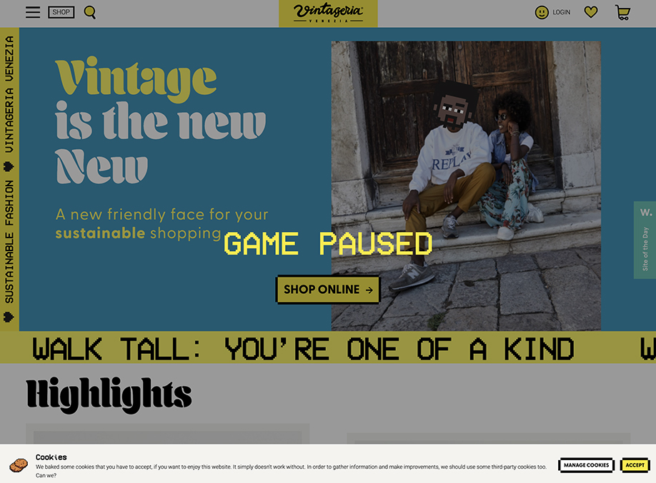
A pop-up box that has a chewed off cookie with crumbs and unconventional language. It’s fun, engaging and matches the rest of the experience of their website.

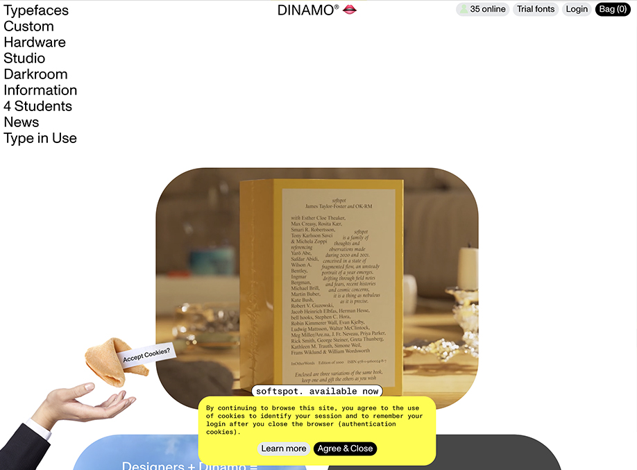
Using cartoonish cookies reduces the seriousness of a topic like data collection, they do it well.

Sometimes it’s important to let your visitors know about your cookie policies, so if that’s important for you then this is definitely a good example.

Not all cookie policies are created equal and neither is design! If you have a variety of policies and want to give your visitors the option to opt-in for specific ones, then this is a perfect way to execute it. The button that you would want most people to click (Accept All) is highlighted, so the eyes are drawn to that automatically.
We hope that these awesome examples have been helpful – rock on!
